iOS Application
Was It Worth It
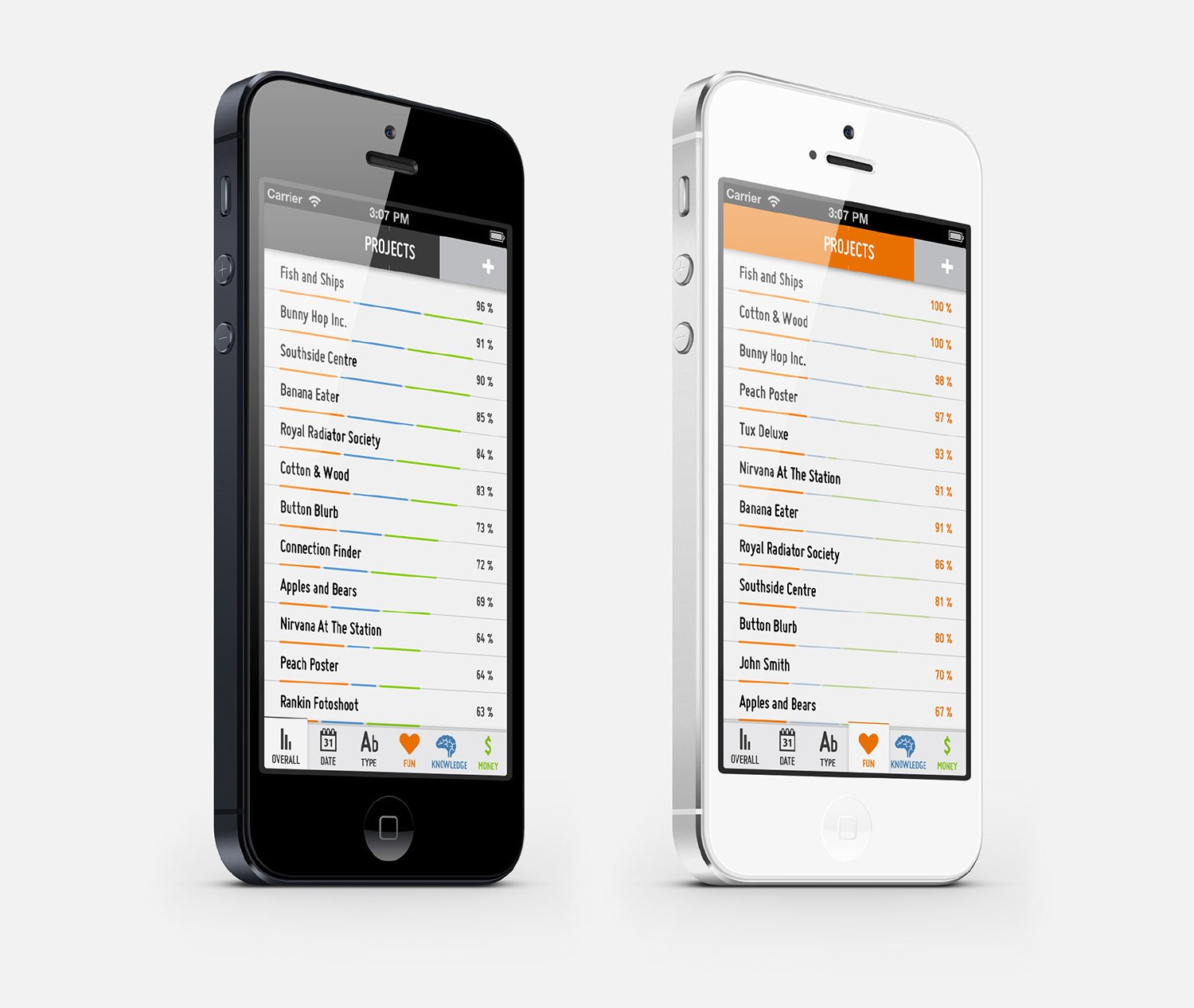
Was It Worth It is a playful app that visualises your projects based on how much fun, knowledge or money you’ve gained from them – telling you whether they were worth doing or not.
The app lets you review your project history at a glance by creating a hybrid list and graph view.
You can sort through your projects using different values: worthiness, date, type, fun, knowledge and money.
The top bar on the app screen is animated and fills up with the projects’ average worthiness, calculated by overall, fun, knowledge or money values so you can see how you’re doing in general.
Was It Worth It is a fun and useful app for any creative freelancer interested in measuring the success and value of their work. It is beautifully simple in its functionality but deep in terms of insight it can provide.
Process
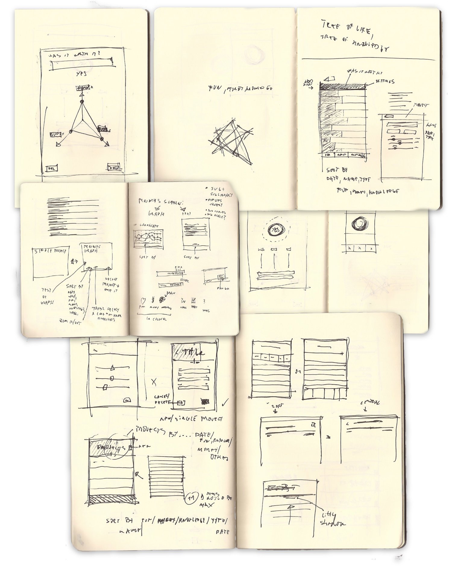
Initial visualisation sketches played with the idea of a readjustable triangle. A clear way of instantly knowing whether a project was worth it or not was conceived with a top bar getting filled up.
As the screen real-estate is scarce on the iPhone the table view had to combine the list (of projects) with their “worthiness”. If the app was any good this needed to be solved well.
Graph Studies
Various different studies of the list/graph hybrid were investigated.
Light and dark schemes
Light and dark designs imagined. In both cases the adding of the projects had to be quick and fun to do. Just a simple drag of a slider and you could see the “worth it” (top) bar growing.
Prototype and product iterations.
After several refinements and amends, the final product was born and launched on the App store. Within the first week it got over 8000+ downloads and various mentions in design blogs such as Swissmiss among others.


